Economic growth is the worst
A quick summary
Economists push the need for more and more economic growth
But economic growth has very serious negative consequences
But also: economic growth is super important. It boosts people’s living standards and creates the resources to fund a range of economic initiatives
The challenge is how to grow in a way that mitigates some of the negative impacts
Don’t be fooled
“Economic growth is terrific.”
You hear this from your teacher or an economist or maybe even a politician.
But I implore you: be skeptical of this claim. Economic growth is terrible*.
I’ve got four reasons why economic growth sucks. Or, in a more articulate way, there are four negative consequences of economic growth.
(*Please read all the way to the end.)
Economic growth is terrible because it results in higher prices
Let’s say economic growth is rising in an economy. So aggregate demand is rising…however, firms may not have enough time to increase production to match this rise in demand.
Look at it from this perspective. As the economy grows, consumers’ incomes rise. This means they can afford more goods and services. However, there is limited stock of goods and services.
“In fact, consumers use their extra income to ‘bid up’ the prices of limited goods and services, which then results in higher prices. I like to think about extra money ‘chasing’ the same amount of goods and services.”
So we would say that the rise in aggregate demand is outstripping aggregate supply (because firms haven’t had time to produce more goods and services). This leads to demand-pull inflation.
[Just remember: aggregate demand affects economic growth in the short term, while aggregate supply affects growth in the longer term.]
But we may also see cost-push inflation. This is because higher economic growth leads to greater demand for the inputs of production, which will lead to higher costs for businesses.
Think about it this way: economic growth leads to greater demand for labour, which will result in lower unemployment. As firms need more and more workers, they will need to pay higher wages to poach them from other firms (because unemployment is so low). This leads to higher inputs costs (wages) which will result in firms pushing up the prices of goods and services (cost-push inflation).
Also, during a period of economic growth, many firms will demand more inputs to meet the higher demand for goods and services. As a result, the prices of inputs like raw materials will also rise and this will further lead to cost-push inflation.
Learn more about cost-push inflation
Economic growth is terrible because it results in higher prices and then higher interest rates
As we’ve seen in the previous section, higher economic growth generally leads to rising inflation.
If inflation is rising in Australia, the central bank will act. The Reserve Bank will raise the cash rate, the official level of interest rates, to indirectly increase interest rates across the economy and slow inflation.
What’s the issue with the higher rates?

The RBA will act.
Australia’s central bank will adjust the cash rate if inflationary pressures are rising.
Higher interest rates will result in less investment. This is because higher rates mean higher interest repayments for borrowers.
Higher interest rates could also result in a higher exchange rate. This is because more foreign investors could be motivated to save their money in Australia as the returns could be higher. A higher exchange rate could make Australian exports less competitive.
Economic growth is terrible because it results in environmental degradation (and therefore lower living standards)
Economic growth is still highly dependent on the use of fossil fuels. In order to increase output, we need to use non-renewable resources, such as oil and minerals, which reduces the ability of future generations to harness these resources.

The more economic growth, the more pollution.
In addition, the use of fossil fuels leads to higher pollution. This leads to environmental degradation (which may not be fixable) and potentially lower living standards. Think about how pollution could result in poorer air or water quality. This has negative implications for future generations.
Economic growth is terrible because it can worsen income and wealth inequality
This is a trickier point. One view is that economic growth will reduce income inequality as it results in higher wages for lower-income earners. Or that it leads to the unemployed gaining jobs which then leads to them having higher wages. And overall, income inequality is reduced.
There’s another view to consider.
The wealthier people in society own more assets, including shares, homes and investment properties. So if the economy grows and asset values rise, this would deliver greater benefits to those who are already wealthy. They would receive greater dividends, rent and other incomes flows from their assets. According to this view, as economic growth rises, income and wealth inequality could rise.
*But we need economic growth
Yes, economic growth has negative consequences. Quite serious negative consequences in some cases. But we need economic growth.
This blog post has a deliberately sarcastic tone. Don’t start writing essays where you make the case for GDP growth of 0%. This will be unhelpful for your marks.
You see, economic growth delivers so many benefits to a country and its population, including rising living standards and higher wages.
The issue here is how we pursue economic and growth and what do we do with the benefits of economic growth.
For example, could countries try to grow more sustainably, with less of a reliance on fossil fuels? And could countries direct some of their benefits from economic growth to addressing some of the negative consequences of growth?
We can’t choose not to grow. But we can talk about how economies should choose how they grow.
How do movements in the TERMS OF TRADE affect the Australian economy?
Quick summary
Australia’s Terms of Trade is the ratio between export prices and import prices for the economy. It is a ratio that involves prices, NOT volumes
An improvement in the Terms of Trade means export prices are rising faster than import prices. This is likely to lead to higher economic growth and rising living standards
An improvement in the Terms of Trade means import prices are rising faster than export prices. This could accelerate AND slow economic growth (confusing!) but would likely lower living standards
Thanks for the question Emily!
Big shout out to Emily S for her great comment below.

[VCE is the final high school exam for students in Victoria.]
I read Emily’s question and it set my brain on fire. What a great question. Time for a comprehensive answer.
I’m going to go beyond Emily’s scope and discuss the impact of a favourable and unfavourable movement in the Terms of Trade. I hope she doesn’t mind.
What is the Terms of Trade?
It’s worth starting with a definition: the Terms of Trade (TOT) is the ratio of export prices to import prices.
The terms of trade index = (export price index/import price index)*100
The TOT is a measure of the prices of exports and imports. It does NOT measure volumes.
Think about it this way:
Export prices represent income for an economy. If Australia sells exports to China, the goods or services go to China BUT the revenue arrives in Australia. Exports are an injection for the Australian economy.
Import prices represent a cost for an economy. If Australia buys imports from China, the goods or services arrive in Australia BUT income leaves Australia and arrives in China. In this way, imports are a leakage for the Australian economy.
What does the Terms of Trade show?
For an economy, exports represent revenue and imports represent costs.
If exports prices rise relative to import prices (so export prices rise faster than import prices), then a country can afford to buy more imports with the same volume of exports.
If import prices rise relative to export prices (so import prices rise faster than export prices), then a country can afford to buy less imports with the same volume of exports.
Here’s a way to think about it. Export prices represent the amount of income Australia earns. If Australia earns more (export prices rise in relative terms), it can buy more stuff. And stuff = imports.
If Australia earns less (export prices fall in relative terms), it can buy less stuff. And stuff = imports.
Still confused about what the Terms of Trade means?
Check out my video setting out the concept.
What happens to the Australian economy when the Terms of Trade improves?
This is what’s known as a favourable movement in the TOT.
When the TOT improves, this means export prices are rising faster than import prices.
If export prices are higher, this means that Australia is earning more revenue from the sale of exports. This is because for every export sold, Australia receives more revenue (NOT PROFIT).
When Australia’s TOT improves, this is usually due to higher prices for Australia’s natural resources and/or rural commodity exports. These rising prices send a signal to investors that demand for some of Australia’s exports is growing and it may be a good time to invest in the natural resource and rural sectors. If they invest now, they can hopefully earn a higher return as the growth continues.
So, there are a number of consequences from this change in the TOT:
There will be greater investment in Australia’s export sectors. This will increase capital inflows (foreign direct investment and portfolio investment) and lead to greater income outflows (as recorded in the Balance of Payments)
There will be greater demand for workers in the export sectors. Rising prices are due to higher demand; higher demand means that local firms may need extra workers to meet the rising demand. The extra foreign investment means they are extra resources to pay for more workers. As a result, employment could grow in the export sector.
In addition, a favourable movement in the TOT means that Australians can now buy more imports with the same volume of exports. This means Australians can afford more goods and services. As a result, living standards will improve.
Let’s go back to Emily’s question (not her real one but my expanded one)
How would a favourable movement in the TOT affect strong and sustainable economic growth and living standards?
Economic growth will rise.
This is because export volumes are likely to be rising. Rising prices are a signal of higher demand. Exports are a component of aggregate demand. So: higher export sales, higher economic growth.
This is also because investment is likely to be rising. This is because more people will invest in Australia’s export industries when prices are rising. Investment is a component of aggregate demand. So: higher investment, higher economic growth.
And then living standards will be higher. This is because Australians can buy more imports (good and services) with the same volume of exports. This, in turn, is because exports command higher prices.
What happens to the Australian economy when the Terms of Trade worsens?
This is what’s known as an unfavourable movement in the TOT.
It is also referred to as a deterioration in the TOT.
When the TOT worsens, this means export prices are rising faster than import prices.
If export prices are relatively lower, this means that Australia is earning less revenue from the sale of exports. This is because for every export sold, Australia receives less revenue (NOT PROFIT).
When Australia’s TOT deteriorates, Australians can buy fewer imports with the same volume of exports. This means that Australians can afford fewer imported goods and services. Therefore, living standards will worsen.
If Australia’s export prices are relatively lower, then there could be less interest in investing in Australia’s export sectors. This could reduce capital inflows (FDI and portfolio) and then reduce the size of income outflows.
Here’s a tricky part. If Australia’s TOT worsens, then Australia’s exports command relatively lower prices. This could actually make them more competitive. As a result, we could see greater demand for Australia’s exports. This would lead to greater sales of export volumes, which would boost aggregate demand and economic growth.
Basically: if the TOT worsens, then Australia’s exports are relatively cheaper. This means Australia could sell more and economic growth could improve.
Let’s go back to Emily’s actual question
How would an unfavourable movement in the TOT affect strong and sustainable economic growth and living standards?
Living standards would be lower. This is because Australians could afford fewer imported goods and services. Why? Because the same volume of exports can now purchase a smaller amount of imports.
For economic growth, there are some competing events.
Export volumes could be falling. This is because fallings prices are a signal of lower demand. Exports are a component of aggregate demand. So: lower export sales, lower economic growth.
Then investment could be falling. This is because less people will invest in Australia’s export industries when prices are falling. Investment is a component of aggregate demand. So: higher investment, higher economic growth.
But! If exports are relatively cheaper, then more people may wish to buy them. These exports are now more internationally competitive. This could increase export volumes and increase economic growth (over time).
Which factor would have a bigger impact? It would depend. But if you discuss both possibilities (higher and lower growth), this shows the marker you understand the complexity of this economic theory.
The connection between elasticity and the Terms of Trade
Elasticity of demand relates to the sensitivity of quantity demanded to a change in price.
If export prices rise, we would usually expect the demand for export prices to fall. This would be true for elastic goods. A small rise in price would lead to a large fall in quantity demanded.
But what happens if quantity demanded is inelastic? This means that a moderate rise in price may only lead to a small fall in quantity demanded.
We can consider Australia’s commodity exports as relatively inelastic. This is because they are high quality, highly sought after and available in large quantities. So even if the price of these exports rise, countries such as China will still want to buy large amounts of exports.
So if the exports are relatively inelastic, even if the TOT improves, other countries will still purchase large volumes of Australia’s exports and economic growth will rise.
Ask your questions!
Thanks again to Emily for the question. Hopefully this answer helps. Send me your questions!
Now take a look at recent developments in Australia’s Terms of Trade in the video below.
Australia's inflation rate is rising rapidly
Quick summary:
Australia’s inflation rate is rising rapidly — in the March quarter 2022, consumer prices are rising by 5.1 per cent in annual terms
Prices are rising across most sectors of the Australian economy, particularly for food, housing and transport
The Reserve Bank of Australia will being raising the cash rate to slow inflation and bring it back into the central bank’s inflation target band of 2 to 3 per cent over the course of the business cycle.
The Reserve Bank of Australia (RBA) has a target for Australia’s inflation rate of between 2 and 3 per cent. In the March quarter of 2022, Australia’s yearly inflation rate was 5.1 per cent.
“Australia, we have an inflation problem.”
What is inflation?
Inflation is a sustained increase in the general level of prices. The important point is “sustained”. We’re not looking for a one-off jump in prices. As economists, we’re looking for price rises that persist for a period of time.
The “sustained” part is crucial because we don’t want to change economic policy for temporary things. For example, if prices rise in one quarter, but fall the next, the RBA may not need to raise the cash rate. But if we see prices rise quarter after quarter, it may be time for a tightening of monetary policy (higher cash rates).
Are you wondering what inflation even is?
Check out my video.
How is inflation measured?
Every quarter the Australian Bureau of Statistics (ABS) publishes the Consumer Price Index (CPI). This measures the changes in prices for the types of goods and services that households spend most of their money on.
The ABS refers to this as a ‘basket of goods’. These goods and services are weighted based on their relative importance to households. This is because a rise in the price of certain goods and services would have more of an impact than others. For example, a rise in the price of food would be weighted more heavily (have more impact on the CPI) than a rise in the price of Prada sneakers.
Why? Because the sad truth is more households can afford food than Prada sneakers.
“The sad truth is more households can afford food than Prada sneakers.”
The ABS’ ‘basket’ covers eleven groups:
Food and non-alcoholic beverages
Alcohol and tobacco
Clothing and footwear
Housing
Furnishings, household equipment and services
Health
Transport
Communication
Recreation and culture
Education
Insurance and financial services
What happened to Australia’s inflation rate in the March quarter of 2022?
In late April, the ABS published the March quarter CPI. This covers January, February and March 2022.
Australia’s CPI rose by 2.1 per cent in the March quarter compared to the December quarter. By way of comparison, the CPI rose by 1.3 per cent in the December quarter of 2021 compared to the September quarter of 2021.
So: inflation is clearly on the way up.
Moreover, the annual rate of inflation has increased substantially. If we compare the March quarter of 2022 with the March quarter of 2021, the CPI has risen by 5.1 per cent.

Your quick summary of Australia’s complex inflation picture. You’re welcome.
Which prices are rising fastest in the Australian economy?
You can see the main contributors to the rising inflation rate in the graph below.
Let’s focus on a couple of the areas.
Food and non-alcoholic beverages (up by 2.8 per cent in the March quarter)
According to the ABS, prices across ALL food and non-food grocery products in the March quarter
This was due to the cost of COVID-related supply chain disruptions (reducing stock and pushing up prices), rising transport costs (related to the rising cost of fuel) and challenging weather conditions such as floods
Housing (up by 2.7 per cent in the March quarter)
Australia’s housing market was relatively strong in the quarter which led to higher prices for homes and rents
In addition, there are rising construction costs for new home builds and renovations. Builders are passing on these costs to home owners, resulting in rising prices
Transport (up by 4.2 per cent in the March quarter)
The price of petrol rose by 11 per cent due to the a spike in global oil prices following Russia’s invasion of Ukraine
Petrol prices have also risen as COVID-related travel restrictions have eased and people are demanding more fuel as they travel greater distances
Car prices have also been rising as supply chain disruptions have restricted the arrival of new cars into Australia (less supply combined with strong demand leads to higher prices)
Just look at this chart of how fast petrol prices have risen in the Australian economy. Businesses are passing these costs on to consumers; this then results in cost-push inflation.

Petrol prices are really pushing p…rices higher.
Headline versus underlying inflation
Australia’s headline inflation rate includes all prices changes in the economy. Australia’s underlying inflation rate excludes one-off or volatile price changes in the economy.
The RBA focuses on underlying inflation. This is because when the central is deciding whether or not to change the cash rate, it wants to respond to ongoing trends in the Australian economy and NOT one-off price shocks that might quickly dissipate.
The RBA looks at two measures of underlying inflation — the trimmed median and weighted mean. Don’t worry too much about what they’re called. Just know this: the RBA’s preferred measures of inflation show that Australia’s underlying inflation rate in the March quarter 2022 is around 3.45 per cent — above the central bank’s target band of 2 to 3 per cent.
What are the impacts of Australia’s rising inflation rate?
The key impact is that the cash rate will soon rise. This could happen as early as 2 May when the RBA holds its next board meeting to discuss the cash rate.
This means Australia’s monetary policy will have a contractionary stance and wil slow the level of economic growth.
At the same time, Australia’s fiscal policy — the federal budget — is still having a large expansionary impact on the Australian economy. Read about it here.
Australian Economy update: April 2022
What’s happening with the Australian economy in early 2022?
Here’s some blogs that cover three key developments in this time period.

The 2022 Australian Federal Budget
Understand these FOUR GRAPHS and you’ll understand the Morrison Government’s 2022-23 Federal Budget.

Australia’s Current Account Surplus
As of April 2022, Australia has a Current Account Surplus. What does this mean and why does it matter? (Because it DOES MATTER!)

Everything’s more expensive in Australia
Inflation’s on the rise in Australia. Why? Because prices are more expensive for businesses. Because: cost-push inflation.
Four graphs that explain the 2022 Federal Budget
QUICK SUMMARY
The 2022-23 Federal Budget was handed down in March 2022
The Morrison Government is forecasting ongoing budget deficits (government spending exceeds government revenue)
However, the Morrison Government forecasts that the size of the budget deficits will shrink over the next decade
The most important factor: the reduction in government spending and increase in tax revenue as the economy improves during the COVID-19 pandemic.
In this blog post, I’ll look at these four graphs (click the links to jump there):
Total government payments (spending) and receipts (revenue)
Size of Australian government debt
Australia’s government debt levels compared to other advanced economies
Graph one: The budget balance
This graph (labelled Chart 3.2 below) shows how the budget deficit will shrink to approach a balanced budget by 2032-33.

Overall, this graph shows the size of the budget balance as a percentage of GDP. If the number is positive, Australia has a budget surplus. If the number is negative, Australia has a budget deficit. If the number is zero — the budget is balanced.
Look at the black line. Before COVID, the federal budget was balanced and potentially returning to surplus. Once the pandemic hits, the government significantly increases spending to help ease the effects of COVID. As a result, the black line plummets and Australia’s budget deficit peaks at around 6 per cent of GDP (the -6% number).
Then follow the blue line. This is the Morrison Government’s forecasts for how the budget balance will change. The point: the government expects the budget deficit to shrink.
In economic terms, this is known as “fiscal consolidation” or “fiscal repair”, where the government is running contractionary fiscal policy to reduce the budget deficit and return to a balanced or surplus budget.
So the government is forecasting an ongoing improvement in the budget balance to approach a balanced budget in 2032-33. Note: the further out the forecasts, the less certain we can be about them.
Graph two: Total government payments (spending) and receipts (revenue)
This graph (labelled Chart 3.8 below) shows that Government spending spiked during 2021 and is substantially falling as the temporary COVID-related spending decreases or ends.
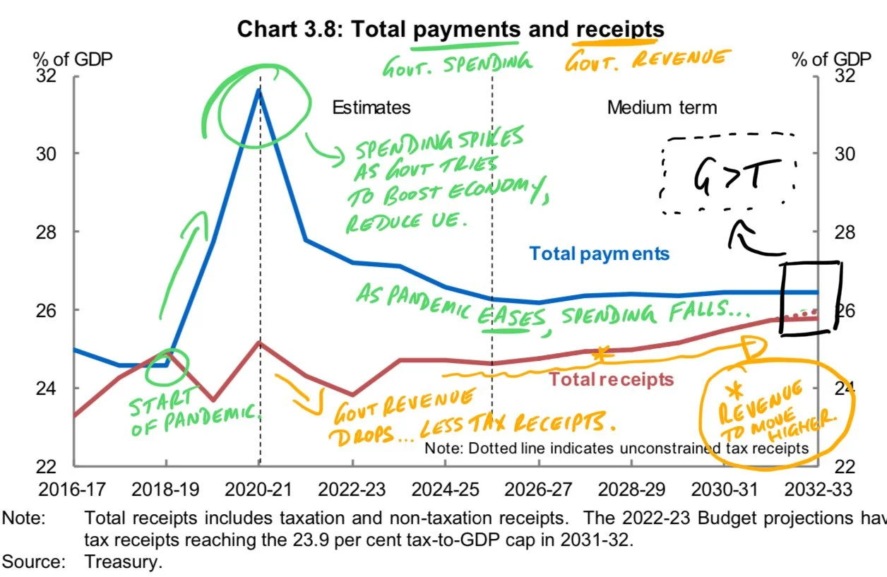
The red line is government revenue, which mainly comes from individual and company tax. The blue line is government spending, which is dominated by spending on welfare payments.
Focus on the left hand side of the graph. You can see that the blue and red lines intersect. This shows us that spending was equal to revenue and the budget was balanced.
As the pandemic starts, government spending significantly increases. You can see that government spending peaks at around 32 per cent of GDP as the Morrison Government tried to offset the worst impacts of COVID. This included significant spending on Job Seeker and Job Keeper programs that aimed to keep people employed, even as businesses had to temporarily close or restrict trading, and stop unemployment rapidly rising.
At the same time, revenue decreased at certain points — but not as significantly. This was due to lower tax revenue as more people were unemployed and companies earned lower profits (because they were forced to shut during lockdowns).
Take a look at the period from 2022-23 onwards. Pandemic-related spending is projected to substantially fall. At the same time, as the Australian economy is forecast to recover and grow more rapidly, government revenue is projected to increase. This will shrink the difference between government spending and government revenue.
This, in turn, will shrink the size of the budget deficit.
So the reason why the government is forecasting smaller budget deficits is because:
Less spending on programs that were designed to protect the economy from the effects of COVID
More revenue as the Australian economy recovers from COVID.
This is evident from the graph — the shrinking distance between the blue and red lines.
Graph three: Size of Australian Government debt
According to the 2022 Federal Budget, the Morrison Government forecasts that the size of federal government debt will shrink more quickly than previously thought.
This chart (labelled Chart 3.1 below) shows the size of the federal government’s debt.

A quick note about debt and deficit. The budget deficit means that there is a discrepancy between government spending and revenue. Government spending exceeds government revenue. This creates a deficit of funds in the federal budget because the government is spending more than it earns.
And if the government has a deficit, it needs to find the funds to pay for its extra spending. To fund the gap between spending and revenue, the government will borrow money from overseas. That is, it will incur more debt.
Have a look at the left hand side of the graph. Pre-pandemic, the government’s debt was relatively flat around 30 per cent of GDP. COVID hits, the Morrison Government starts spending to try and protect the Australian economy and stop unemployment soaring. To pay for this extra spending, the government borrowed increasing amounts of money from overseas.
The three lines show us that, over the past three years, the government has forecast that the amount of funds it needs to be borrow will be less and less. For example, in the 2020-21 budget, the Morrison Government forecast that government debt might get to around 55 per cent of GDP. However, as the Australian economy has improved and the budget deficit is projected to shrink, the amount of debt is also expected to shrink. Now, the government expects debt will fall to around 40 per cent of GDP by 2032-33.
Here’s the key thing: as the budget deficit shrinks, the government will need to borrow less money to fund the gap between spending and revenue. This means the size of government debt will also fall.
Graph four: Australia’s government debt compared to other advanced economies
The Australian Government’s debt (as seen in Chart 3.9 below) can be considered comparable or low compared to other developed economies.

The graph above shows how all G7 economies have increased spending and their debt levels because of COVID. However, this graph shows that the size of Australia’s debt levels is either similar to or substantially lower than the debt levels of G7 economies.
For example, in the US, government debt levels exceed 100 per cent of GDP. And these levels are even higher in Italy and Japan.
The important thing to think about is that the larger the amount of debt, the longer it will take to repay and the greater amount of interest payments required to service these loans. This could be an issue as global interest rates are expected to rise over 2022.
One last thing
Here’s a small summary table from the 2022 Federal Budget that shows how the Morrison Government expects the budget deficit to shrink over the next five years. These numbers are great to have handy for essay questions on fiscal policy.

And here’s a short explainer on how changes in the federal budget then affect the Australian economy.
Does Australia have a current account surplus? (Yes -- and it's kind of a big deal)
The quick version:
Australia has a current account surplus (CAS)
This is the first time Australia has recorded a CAS since the late 1970s
Australia’s CAS is caused by its Balance on Goods and Services surplus. The Net Primary Income balance is still in deficit.
Australia has a current account surplus. This is important
When I studied Economics at high school we never talked about a current account surplus (the CAS). Australia simply didn’t record a CAS. Instead, Australia was known for its current account deficits (CAD).
Things have changed in 2022. Australia has had a CAS for a period of time and it’s an economic statistic that signals some important things about the Australian economy.
Let’s rewind a little.
My HSC Economics exam and writing about a current account deficit
When I sat my HSC Economics exam, we only ever wrote about Australia having a current account deficit. We NEVER talked about current account surpluses.
Have a look at this stimulus for one of the essay questions.

Source: NESA
You can see that the current account balance for 1997/98 was a deficit for $23 billion. Let’s fast forward to now.
In the September quarter of 2021, Australia recorded a CAS of nearly $22 billion.
This CAS shrank to around $13 billion in the December quarter. But Australia still has a current account surplus.
On a personal note, I never thought Australia would have a CAS. Why would I? Have a look at this graph below. For my lifetime (up until now), Australia has had a persistent CAD.

The numbers on the right hand side of the graph represent the size of the current account balance as a percentage of GDP. So the larger the % of GDP, the larger the size of the CAD. You can see that in the mid-2000s the CAD was over 7% of GDP – a very large amount.
Why does Australia have a current account surplus in 2022?
The key drivers of Australia’s CA balance are:
The Balance on Goods and Services (BoGS)
The Net Primary Income (NPY) balance
As the value of BoGS and NPY change, so does the balance on the current account. Typically, Australia’s BoGS fluctuates considerably – due to the frequent changes in the prices and volumes of our exports. For example, the price of iron ore rarely stays the same. It’s not like manufactured goods that have relatively consistent prices. An iPhone’s price doesn’t fluctuate from day to day.
Australia has a persistent NPY deficit. This hasn’t changed.
So why has the CA has moved into surplus? Because of Australia’s BoGS surplus.
Have a look at this graph.
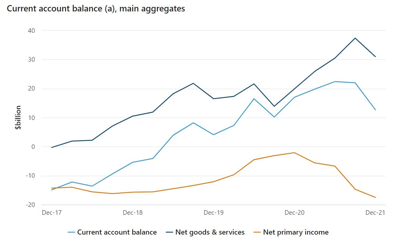
Source: Australian Bureau of Statistics
You can see that BoGS – the dark blue line – is leading the CA balance higher into surplus.
NPY is actually getting larger – the deficit is growing. This is pushing the CA balance the other way — so reducing the size of the surplus.
So the driver of the current CA surplus is the BoGS surplus. You can also call BoGS the trade balance or net exports.
Australia’s BoGS surplus is caused by an increase in Australia’s export sales (particularly of natural resources) and a slowdown in import spending (due to the impact of the pandemic).
What are the consequences of Australia’s CAS?
Here are some of the consequences of Australia’s CAS.
As Australia is selling more exports, there is greater demand for labour/resources into the export sector. This is to meet the growing demand for overseas markets.
Australia may also require greater investment in the mining sector to help increase the volume of natural resources that can be obtained and sold overseas. This could increase capital inflows in the form of loans from overseas. This, in turn, will increase income outflows and then increase the value of the NPY deficit.
In addition, as exports will be growing, they will contribute more to Australia’s aggregate demand. This is because AD = C+I+G+(X-M). So, as exports volumes rise, they will positively influence net exports (X-M), which will add positively to AD and the nation’s economic growth.
Not a lot of people are talking about the CAS. But they should be. It’s a very important statistic with important consequences for the Australian economy.
Want more on why Australia has a current account surplus?
I also have this video that looks at the drivers of a CAS (see below). It could be very helpful in trying to grasp this potentially tricky concept. A concept I never thought I’d see in my life.
Your favourite businesses are raising prices. Here's why
The quick version:
Cost-push inflation is when rising input costs lead businesses to raise retail prices
Rising input prices include higher wages, energy and rent costs (these higher costs push up retail prices)
Cost-push inflation is happening in Australia in 2022. According to the National Australia Bank, business purchase costs are at record levels. This is leading to higher inflation in the Australian economy.

Cost-push inflation is rising in Australia.
What is cost-push inflation?
Cost-push inflation is a cause of inflation. It occurs when higher input costs for businesses PUSH UP prices across the economy.
Basically firms face higher input costs and, rather than absorb these costs and reduce profits, they pass on higher costs to consumers.
The end result: consumers pay higher prices.
An example of cost-push inflation
As of April 2022, Australia’s unemployment rate is a very low 4 per cent. This means that businesses may find it hard to secure workers as many people are already employed. To attract workers, firms may need to pay higher wages. And wages are a cost for businesses.
A firm could absorb the higher wages cost. But this would reduce their profit (as profit = revenue - costs). Instead, the firm will pass on the cost of higher wages to consumers in the form of higher prices. Consumers will ultimately pay for the higher employee wages.
When prices rise, inflation rises. In our example, input costs (wages) have pushed inflation higher.
Other sources of cost-push inflation could be higher energy prices (electricity or petrol), more expensive food and higher rental costs.

How cost-push inflation works
Cost-push inflation in the Australian economy in 2022
National Australia Bank (NAB), one of Australia’s big four banks, publishes a monthly business survey. According to the survey, firms’ purchase costs (the cost of their inputs) rose by 4.2 per cent in the March quarter.
[The March quarter covers January, February and March.]
This 4.2 per cent rise is a record for the NAB survey. The survey also found that labour costs — as discussed in our example above — rose by 2.7 per cent in the March quarter. This was another record rise.
NAB Chief Economist Alan Oster said that many industries were experiencing rising input costs. This is what the survey calls ‘purchase costs’.
“Purchase costs reached records with elevated oil prices adding to existing supply chain issues, and labour costs are also rising as businesses hire more workers in a very competitive labour market,” Mr Oster said.
These rising input costs are leading directly to higher prices. According to the NAB survey, retail prices rose by 3.7 per cent over the March quarter of 2022. This is a record level for the survey.
Why does cost-push inflation matter?
Rising cost-push inflation is another sign that Australia’s inflation rate is rising (potentially rapidly) . This adds to the likelihood that the Reserve Bank of Australia will soon begin raising the cash rate to try and control inflation. The RBA meets monthly and many economists believe the cash rate could be raised as soon as June 2022.
When we talk about the RBA raising rates, we’re discussing monetary policy. Check out this article for more about this important macroeconomic policy.
What is economics?
Economics is difficult to do. It can be even more difficult to define.
What is economics?
Let’s start by asking a different question: what is an economy?
An economy is a way of organising society.
This sounds complicated. Your teacher may have used these exact words. But we’ll simplify it.
Coming at things from a different angle
Think about this question: how does society produce an apple?
You might want an apple today, tomorrow or some point in the future. But how do we make sure that you can actually get this apple when you want it?
Society doesn’t automatically produce apples, pears, oranges, iPhones or anything. We have to make choices.
More specifically, we have to make deliberate decisions to ensure:
Certain goods and services are actually provided (like apples!)
That enough goods and services are provided for society (like enough apples, so you can have one today, tomorrow and in the future).
These decisions don’t happen automatically. We have to make choices on what to produce, how much to make and where to make it.
So what is economics?
Economics is all about how we organise society to produce the goods and services that society requires. You can think about economics as the study of choices.
For example, what are all the things that need to happen in society so that you can walk into a shop and purchase a pair of sneakers?
[Just a brief reminder: sneakers don’t automatically exist in society. They have to be deliberately produced.]
For the sneakers:
The sneaker company needs to organise its designers to come up with a new shoe model. The company needs to decide which designs will actually be produced.
The sneaker company then needs to find all the raw materials that will go into making the shoe. It needs to choose the materials and purchase them in sufficient quantities to produce the right number of shoes.
The sneaker company then needs to decide how it will ship the sneakers to stores and consumers.
And so on.
Economics is about how society — which includes individuals, firms and governments — organises itself to produce goods and services. Economics involves the choices that individuals, firms and governments need to make to produce these goods and services.
But why do we have to make choices?
Society cannot have all the goods and services that it wants. This is because of the concept of scarcity.
The things that are used to produce goods and services, known as resources, are limited. For example, you don’t have all the time in the world — you’ve got 24 hours a day. The Australian Government doesn’t have infinite money — it only has access to limited funds at any time.
This means choices must be made. The sneaker company can’t produce all of its designs, nor can it make an unlimited number of sneakers. It has to make choices.
Thus, economics is the study of choices.
This all relates to the economic problem. I’ve written about the economic problem as well.
The circular flow of income: problems with the model
As part of your Economics study, you’ve probably done the Circular Flow of Income Model. This is also known as the Five Sector Model or the Five Sector Circular Flow of Income Model.
Here’s my explainer on the model. I’ve also written about how the Circular Flow of Income Model helps us understand economic growth.
The Five Sector/Circular Flow model is useful. I like it a lot, I use it all the time. But it’s not perfect. Here are some limitations you should be aware of.
A general limitation: The model heavily simplifies the economy
An economy is an extremely complicated thing. Can we really simplify something so complex into five sectors and 10 flows?
Just think about the household sector. Do all individuals within households act in exactly the same way? What about firms, or financial institutions? It’s hard to lump all these groups into one category and assume they will all take identical actions.
In addition, central banks play a huge role in the economy. They affect the supply of funds, which then indirectly affects the level of interest rates (this is Monetary Policy). This is absent from the model.
A specific limitation: The model excludes households borrowing money from banks
Take a look at the financial sector, which includes banks. According to the model, households deposit their savings with the financial sector.
But where is household borrowing?
The model does show the financial sector investing in businesses — lending firms funds so they can expand and grow. However, the model does not show households borrowing money from banks.
This is a huge flow in the economy. For example, according to the Australian Bureau of Statistics (ABS), in December 2021, households took out nearly $33 billion of new home loans — either to buy a property to live in or to rent out. This is a massive injection into the economy but is excluded from the model.
Likewise, household loan repayments — an ongoing leakage — are also absent.
Another specific limitation: The model excludes firms buying imports
The model shows households buying goods and services from overseas (imports). You can see the flow of money going from households to the international sector. Yet, the model does not show firms buying imports.
Just think about all the goods and services Australian businesses purchase from overseas:
a restaurant purchases fancy cheese from Italy
an outdoor recreation store (like Anaconda) purchases stock from overseas to then sell to local customers
a school buys online products — such as access to the Google or Microsoft suite of products — and this involves money leaving Australia.
These purchases represent a huge flow of income. According to the ABS, in the September quarter of 2021, imports of capital goods (which are mainly done by businesses) totalled around $1.4 billion.
Do these limitations matter?
If we’re using this model to understand the basics of the economy, then no. It helps us understand the mechanics of how money moves around an economy and how the sectors interact with each other.
But like all models, it’s got limitations. We need to know its limitations so we don’t ask the Circular Flow of Income to do too much.
Scared consumers save more
Consumers can save or spend their income. This comes back to the identity Y=C+S.
Yes, consumers have to pay tax. And yes, consumers can use their savings to invest. The key part is that, when consumers receive their pay, they can either spend it now or put it away for later (savings/investment).
My point: the level of savings depends on consumer confidence, and consumer confidence is substantially affected by the economic outlook.
Let’s explain with the use of a graph.
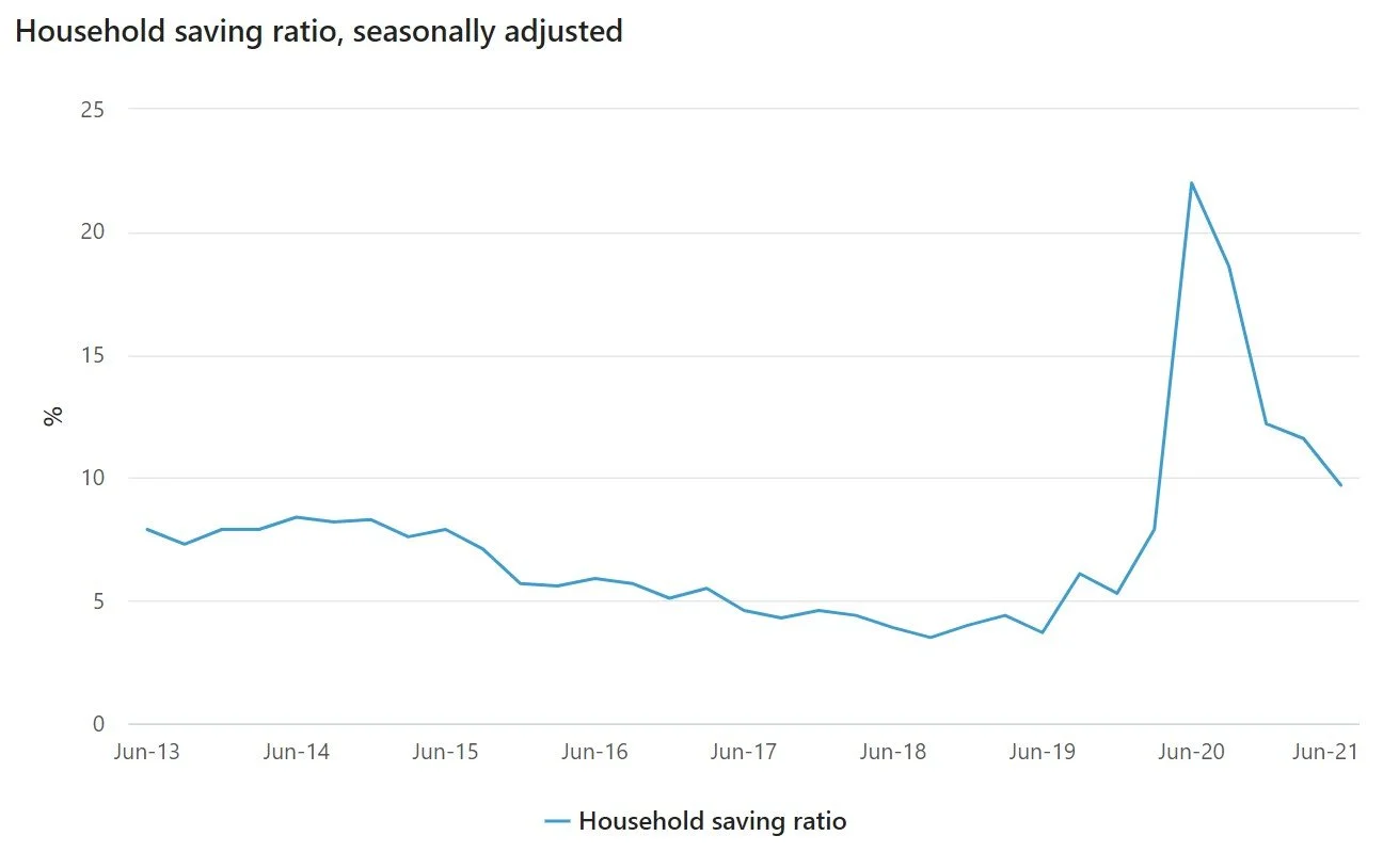
The graph above comes from the Australian Bureau of Statistics from the June quarter national accounts 2021.
Focus on the time frame from around June 2013 until June 2019. You can see that the household savings ratio varies between around 5ish to 9ish per cent (very precise!). This means that, on average, for every $1 of income households earn, they are saving somewhere between 5 and 9 cents. They’re generally spending MOST of their incomes.
Now focus on March of 2020 — see how the savings ratio spikes? This was the first wave of COVID-19 and consumer confidence plummeted. How did consumers respond? By saving a larger chunk of their incomes. In fact, in the June quarter of 2020, the household savings ratio rose to 22 per cent — meaning households were now saving 22 cents for every $1 they earned.
This all comes down to consumer confidence. When the economy is going well, consumers feel confident in the future. They feel confident to spend their money because they believe that the good times will continue and their ability to earn income, to continue spending, will, well, continue!
(You could also think about how their marginal propensity to consume would be higher during ‘good’ economic conditions).
When consumers fear for the future, such as during the height of the first wave of the pandemic, they’ll reduce spending. They don’t know what the future holds. They want to hang on to their funds because they are unsure whether they can continue to earn the same level of income.
(You could think here about how the marginal propensity to save would be higher.)
I’ve annotated the above chart to summarise this info.

I think the household savings ratio is an extremely important statistic. It gives us, as economists, a good indication of consumer confidence. This also has implications for economic growth. This is because savings is a leakage and represents a withdrawal of funds from the economy. The higher the level of saving, the lower the level of consumption, which will put downward pressure on GDP.
I’ve also got a video on the topic you can check out below.
What is going on with this question? (2020 HSC Economics Q20)
I was reviewing the 2020 Economics HSC Exam and found myself frustrated with Q20. After flipping the table, I decided to figure it out for myself.
Let’s start with the question — see below. There’s a lot going on here for one mark.

Source: NESA
Step one: What the hell is going on?
If you look at the first part of the question and the graph, the labour market starts at We. This is the equilibrium wage. At We, the demand for labour equals the supply of labour — there is NO UNEMPLOYMENT. It’s really important we set this up.
Step two: The government sets a minimum wage
The government decides to set a minimum wage which sits ABOVE the equilibrium wage. The government has decided that the equilibrium wage is too low and therefore it should be higher.
The minimum wage is a price floor. This is because the price cannot fall below the level of W1.
But let’s think about what happens with the price floor. Now, supply of labour exceeds demand (see my annotations below). This means that there will be unemployment in the economy because, at a higher wage, more workers are willing to supply their labour BUT employers demand fewer workers because they are more expensive at W1.
I’ve identified the size of unemployment in the graph below.

My annotations. At We, there is no unemployment — demand for labour and supply of labour are equal. Notice how at W1 we get unemployment (UE) where the supply of labour exceeds the demand for labour.
Step three: The Lorenz Curve comes into play
The Lorenz Curve is a measure of income inequality. Have a look at the curve below. You’ve got the line of perfect equality and then the Lorenz Curve.
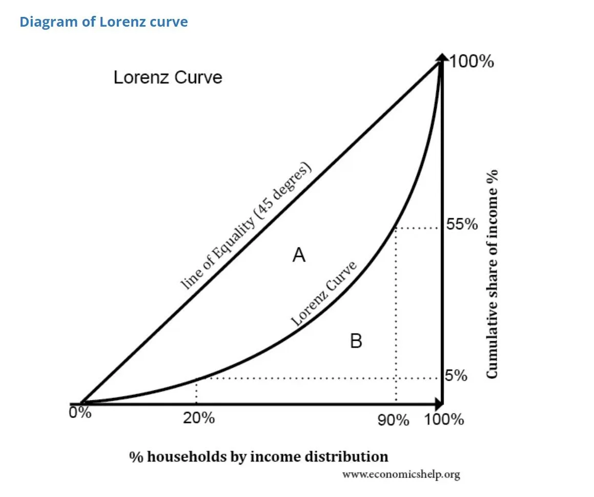
Source: economicshelp.org
If the Lorenz Curve moves left, it is moving closer to the line of perfect equality. So income inequality is improving. This is a move inward of the Lorenz Curve.
If the Lorenz Curve moves right, it is moving further away from the line of perfect equality. So, income inequality is worsening. This is a move outward of the Lorenz Curve.
The question wants us to think about the impact on the Lorenz Curve on the minimum wage.
Step four: What’s the answer?
Now, let’s go through the possible answers.
A: The Lorenz Curve would move inwards as all employees receive a higher wage.
This is incorrect. Not all employees receive a higher wage. Only those who are on the minimum wage would receive a higher wage. So we can eliminate this response.
B: The Lorenz Curve would move inwards as there is an increase in the level of employment.
Go back to the graph. When the government imposes a minimum wage, there is not an increase in employment. Instead, there is an increase in unemployment because, at W1, the supply of labour EXCEEDS the demand for labour. So we can eliminate this response.
C: The Lorenz Curve would move outwards as all employees receive a higher wage.
If we go back to answer A, we can see that all employees DO NOT receive a higher wage. Only those on the minimum wage receive a higher wage. So we can eliminate this response.
D: The Lorenz Curve moves outwards as there is an increase in the level of unemployment.
Okay. So we know that the level of unemployment rises because the supply of labour exceeds the demand for labour. But would the Lorenz Curve move outwards?
The graph shows us that unemployment rises. Who loses their jobs? Those on the minimum wage who now earn more money (W1>We). This means that low income earners would earn less income (i.e. now income because they’re unemployed), which could worsen income inequality. This would cause the Lorenz Curve to move outwards.
Our answer is D. It takes a lot of work to get there.
My advice to you
With the multis, do everything you can to eliminate as many answers as possible. You can see that by ruling out the least likely, we came to the correct answer. Make it at least a 50/50.
Is a current account surplus a good thing?
Let’s start with my point: the current account balance is neither ‘good’ nor’ bad’.
(Okay, I’ll clarify. The current account deficit can be considered too large, if it hits around 6 plus per cent of GDP.)
But, in general, the government doesn’t label the current account balance as ‘good’ or ‘bad’. The Australian government doesn’t try to achieve a particular current account balance. You won’t see ScoMo on the news talking about how only his government can achieve a current account surplus (CAS).
This is because the government has limited control over the factors that drive the current account balance. The government can’t change the amount of exports or imports companies and people buy (trade balance). The government can control how much it borrows from overseas, but it cannot control how much private companies borrow from overseas (this affects the size of capital inflows and then the net primary income balance as a result).
I recently had some students comment on my YouTube channel about the advantages and disadvantages of a current account surplus. I wouldn’t think of it as having specific pros and cons.
I also wouldn’t talk about the government “should” reduce the current account deficit (CAD) or “should” achieve a CAS.
Instead, I would focus on the consequences of the current account balance. It’s a different perspective.
I would divide my thinking up between the consequences of a current account surplus (CAS) and deficit (CAD). If you’re writing about this in 2021, the focus is on the CAS.
Consequences of a CAS
In Australia we’re now talking about current account surpluses. What are the consequences of this?
Let’s think about this from the trade balance and then net primary income (NPY). This is because net exports and NPY are the key drivers of Australia’s current account balance.
Trade balance
If the trade balance is improving, Australia is selling more exports which is increasing GDP and the government’s revenue. This revenue can then be used on a range of functions across society to improve people’s standard of living.
If the trade balance is improving, Australians may be purchasing fewer imports. This could lead to greater purchases of domestically produced goods (maybe) which could boost GDP. The issue I have with this: Australia doesn’t produce the same goods as we import.
NPY
If NPY is shrinking, Australia has a greater stock of domestic funds (as these funds are not needed to service foreign debt). This could boost domestic savings and allow more projects to be funded domestically WITHOUT the need for foreign borrowing. Essentially Australia could shrink its savings-investment gap.
Consequences of a CAD
Your textbook will have a whole list of these. You can also see my video for help.
One thing to note: in the past, the world hasn’t seemed too concerned about the level of our CAD. As recently as 2015, Australia’s CAD was around 5.4 per cent of GDP. This did not spark a mass selling off of the $A!
In terms of positive consequences of a CAD? We could think about points such as:
If the trade balance worsens, maybe Australians have greater access to imports and this improves their standard of living
If the trade balance worsens, maybe Australian businesses have had a greater opportunity to purchase capital equipment for their operations and this could boost productivity and output for the economy
If the net primary income deficit increases, this means Australian individuals and businesses have been able to borrow more funds which could be used for productive purposes across the economy.
Australia’s economic data is released when?
In Australia, key economic data is released throughout the year. By understanding Australia’s economic data calendar, you can be aware of when key data will drop and then incorporate that consistently into your responses.
I tell you this: the use of current (and correct) economic data is extremely important in allowing you to access higher marks in Eco exam situations.
The best source I’ve found for this is Trading Economics.
(If you’ve got trouble only getting Aussie info to appear, or if the timezones are out of whack, try this: select the calendar tab, then countries and make sure only Australia is selected.)
Now you can see the pattern of how economic data is released in Australia. For example, in October 2021, on Tuesday 5 October we get some heavy hitting data:
Balance of trade (Balance on goods and services — the comparison between the value of exports and the value of imports)
Monthly change in exports and imports
Monthly retail sales data (extremely important as it is a vital part of consumption)
Reserve Bank of Australia’s (RBA) cash rate decision

A snippet of the eco data goodness being released in October 2021
Trading Economics shows you what the last result was (“previous”) and the “consensus” view which relates to the average of what economists think the result will be.
You can also start to see the longer-term patterns of when data is released. For example, on 28 October, we get the latest read on inflation data. You can see that it is QoQ (quarter on quarter) and YoY (year on year). And you can see that the previous yearly rate was 3.8% (with a forecast of 2.8%) while the last quarterly rate was 0.8% (with a forecast of 0.7%). The forecasts are done by Trading Economics, while the consensus comes from market economists.
You can also see that on the same day we get the RBA’s own measures of inflation — trimmed mean and weighted mean. This helps the RBA develop its core measures of inflation, which strip out one-off changes and help to give the underlying trend in prices.
One practical way to use this info is to list the key dates in your calendar so you’re reminded when the last eco data releases.
Pay attention to every word
In the HSC exam, every word in every question is deliberate. Each word has a purpose.
That’s why decoding exam questions is so important if you want to access the higher marks on offer.
Let’s take an example. Below is Q18 from the 2020 NSW Economics HSC. It’s a tariff question with lots of words and numbers. I got asked about this specific question by a student and it’s a great example of the power of decoding exam wording.

I think the trickiest part of the question is the expression “total consumption”. What even is total consumption?
Let’s say we’re in the exam and we’re feeling a bit lost. We can decode the words to come to the answer.
First, we can think about consumption as being demand, and demand involving how much of something consumers want over a range of prices.
So — if we think about consumption, consider the fact that the question has told us that:
the economy has introduced international trade
there are imports.
Given all this, total consumption will include the total amount consumers actually want to consume. That is, locally produced goods AND imports. So the 35,000 kg figure includes the amount of cotton produced by the economy AND the 10,000 kg of cotton that is now imported. If 35,000 kg includes exports and imports, and imports are 10,000kg, that leaves domestic production at 25,000 kg.
You can then work out the answer. If domestic product, after the tariff is 25,000 kg, then domestic production has fallen by 5,000 kg. Just calculate tariff revenue and you’re golden.
You can see my working out process below.

My brain in action.
Also, check out the video below for the step-by-step strategies.
Pay very close attention to the wording. Every word serves a purpose in HSC exam questions.
The Five Sector Model (Circular Flow of Income) and economic growth
The Five Sector Model* is a simplified model of how an economy works. It shows how money moves around an economy and involves five sectors only: households, firms, the financial sector, the government sector and the international sector.
[*The Five Sector Model is also known as the Circular Flow of Income Model. Same same.]
If you’re new to the concept, I’ve got a video (below) and you can read more about it here.
In terms of the Five Sector Model, we have injections (money flowing into the economy) and leakages (where money leaves the economy).
The injections are Investment (I), Government Spending (G) and Exports (X). The leakages are Savings (S), Tax (T) and Imports (M).
Let’s look at the relationship between injections and leakages.
When the value of injections EQUALS the value of leakages, the economy is in a state of equilibrium. The economy is neither growing nor slowing; it’s stable.
When the value of injections EXCEEDS the value of leakages, the economy is growing. More money is flowing into the economy than is leaving. As a result, gross domestic product (GDP) is likely rising, unemployment is likely falling and prices are probably on their way up (higher inflation).
When the value of leakages EXCEEDS the value of injections, the economy is slowing. More money is being removed (or withdrawn) from the economy than is being pumped into it. As a result, GDP is likely falling, unemployment is on the rise and prices and probably dropping (lower inflation).
Let’s take an example question. This is Q14 from the 2017 NSW HSC Eco exam.

Source: NESA
If we do the quick maths, we can see that injections equals 115 and leakages equals 125. So this would indicate the the economy is contracting — our answer would be D.
We can also use the Five Sector Model to talk about the budget balance and the trade balance, but we’ll leave this for another post. (For a headstart, check out Q9 from the 2019 HSC Eco exam.)
5 observations on the 2021-22 Federal Budget
The 2021-22 Federal Budget was handed down on 11 May 2021. Here are my five quick observations.
1. The Federal Budget is HIGHLY expansionary
Yes, the size of the budget deficit is shrinking. This means that the budget stance, technically, is contractionary between 2021-22 and 2024-25.
For instance, in 2021-22, the budget deficit is forecast to be $106.6 billion. In 2024-25, it’s forecast to be $57 billion.
But, don’t get it twisted. The budget is still in deficit. The government is still planning to spend substantially more than it earns in revenue (mainly tax revenue). Therefore, the overall impact of Fiscal Policy is expansionary...even if the stance is contractionary between the years.
2. The Federal Budget is about more than stimulating aggregate demand
A major part of the budget involves a large increase in spending on the aged care sector. This is in response to the Royal Commission into aged care which found deficiencies in a number of areas.
This is increased government spending, but it’s not about boosting AD or increasing productivity. After all, this spending is going towards older Australians who are in nursing homes or receiving full-time care at home.
Instead, this measure is largely about improving the quality of life of older Australians. This is an important goal of the government, but it’s more social than economic.
3. The Federal Budget’s boost on childcare spending is an economic measure
The government is offering larger childcare subsidies for parents. The goal here is economic; the goal here is twofold.
One, give people more disposable income by reducing the costs of childcare. (FYI: childcare is very expensive). Parents will spend less on childcare, spend more on consumption...and this will in turn boost AD.
Two, by making childcare cheaper the government is encouraging more parents to use it. The government is actually increasing demand for childcare. This means more parents will be able to work more hours, or potentially return to the labour force. According to Treasury, this will boost the number of hours worked in the Australian economy by 300,000 hours.
4. Fiscal Policy and Monetary Policy are working in tandem
In the past, FP and MP have worked in opposing directions. The RBA had cut the cash rate extensively, however the Morrison Government was keen to protect its goal of a budget surplus and so did not adopt an expansionary stance.
Now both MP and FP are highly expansionary. By working together, it’s hoped their impact on stimulating aggregate demand will be enhanced.
Also, some economists have discussed that the very low cash rate — 0.1% since November 2020 — means that future cuts would not have a major economic impact. If the RBA cuts from 0.1% to 0%, would that dramatically increase consumption and investment? Just remember, the cash rate might be zero but interest rates would not be. The banks would still be looking for a profit margin.
Instead, FP is helping to take up some of the slack.
5. The Federal Government has committed to a return to fiscal discipline
Fiscal discipline or fiscal consolidation is all about moving from a budget deficit back to balanced or surplus budget outcome. The Morrison Government has told us that, yes, we’re in large deficits and, yes, this will persist for some time...but the size of the deficit will be shrinking and there is a target for a return to less expansionary fiscal policy.
The target? When unemployment falls below 5%.
Overall thoughts
In terms of a ‘conclusion’, I really like this article by economist Steven Hamilton. His point of view is that budget deficits are necessary, for now, to drag Australia along the road to recovery. But they cannot persist forever and the government has committed to turn off the expansionary setting once UE falls below its target.
What's an interest rate?
In an economy, interest rates serve really important purposes.
Firstly, interest rates represent the cost of borrowing funds. When you want to borrow money from the bank, you’ll have to pay an interest rate and this will determine the size of the repayments on your loan.
And if you think about it: higher interest rates, higher repayments, so people are less willing to borrow big stacks of money.
Secondly, interest rates are the reward for saving money in the bank. When you deposit savings in your bank account, the bank gives you an incentive for this behaviour — paying you interest, on your savings, at an interest rate.
Think about this one. The higher the interest rate on savings, the more likely people are to save their money. In terms of their incomes, people can spend or save (and pay tax). Generally, the more they save, the less they can spend (because people’s incomes are generally fixed at a point in time). Think about the identity Y=C+S, where Y is income, C is consumption and S is saving.
So in an economy interest rates function as a cost and a benefit. And, as I’ve suggested, interest rates influence people’s behaviour and the level of economic activity.
Let’s take an example here. In the Australian economy, the official level of interest rates is reduced. This means that interest rates, generally, are lower across the whole economy. This will discourage saving as people earn a lower interest rate on their savings; as a result, they will spend more. In addition, lower interest rates mean lower repayments...so there will be more borrowing and investment in the economy.
As a result, the economy is likely to grow.
Tough times for the Australian economy, says RBA
Four times a year, the Reserve Bank of Australia (RBA) shares its assessment of current economic conditions for Australia and the world. This document is called the Statement of Monetary Policy (SOMP). The SOMP for May 2020 sets out some serious challenges for the Australian economy.
I think, as a student, the most important section to focus on is Section 6: Economic Outlook.
I discussed this section in a previous post that looked at the RBA’s three potential scenarios involving the Australian economy’s recovery from COVID-19.
In this post, I’ll take a look at some specific economic forecasts from its May SOMP.
Economic growth
According to the RBA, the Australian economy is “expected to record a contraction in GDP of around 10 per cent over the first half of 2020”. Considering Australia’s GDP grew by around 4 per cent in the first half of 2019, this is a huge turnaround — in a negative sense.
Why is GDP expected to plummet? Well, social distancing means people aren’t going to the shops and spending. The RBA forecasts household spending to fall by 15 per cent in the June quarter this year. In addition, consumers are saving more, as people tend to do in times of uncertainty.
Australia is also not receiving international visitors and their tourist spending. This is classified as export revenue for Australia, and a component of aggregate demand (AD). Less exports mean less economic growth for Australia.
On the flip side, Australians are expected to spend much less on imports.
Unemployment
The RBA estimates that total hours worked in the Australian economy will fall by around 20 per cent in the June quarter (the three months to June 2020). In addition, the RBA says unemployment could rise to around 10 per cent by the same point in time.
Considering the unemployment rate was 5.2 per cent in March 2020, this could represent a near doubling of the number of Australians out of work.
But here’s the thing: while the unemployment rate may not increase by this much, we should still be concerned.
This is because of what’s called “the discouraged worker effect”. This is when an individual gives up looking for work because they don’t believe they will be able to get a job. If people give up looking for work, they’re not considered unemployed and they’d join the hidden unemployed.
(In Australia, to be considered unemployed, you must be out of work and actively seeking a job.)
So Australia’s unemployment rate may not increase by the expected amount, but the economy would still have lost substantial labour resources.
Inflation
Australia, for some time pre-COVID-19, has recorded relatively low inflation rates. This has been part of the reason why the RBA had steadily cut official interest rates.
Due to the pandemic, the RBA expects inflation to turn negative in the June quarter. So: Australia would record deflation.
Why would this happen? Two main reasons. One, fuel prices have fallen dramatically. Just have a look at this chart of unleaded petrol prices in Sydney and how they’ve fallen this year.

Source: PetrolSpy
Two, the Federal Government is providing free childcare to families. So the price of childcare has fallen from something to, well, nothing. These two factors will drag down headline inflation.
Three roads to recovery: The RBA's scenarios for the Australian economy (COVID-19)
Four times a year, the Reserve Bank of Australia shares its assessment of current economic conditions for Australia and the world. This document is called the Statement of Monetary Policy (SOMP). The SOMP for May 2020 sets out some serious challenges for the Australian economy.
I think, as a student, the most important section to focus on is Section 6: Economic Outlook. This is the section that I’ll be discussing in this post.
Three scenarios for recovery
An important part of May’s SOMP is that the RBA has set out three scenarios for Australia’s recovery from COVID-19.
Let’s start with the RBA’s “baseline scenario”. I think we can characterise this as the forecast where things steadily improve. Here are some elements of this scenario:
Australia’s social and business restrictions continue to be relaxed and are mostly removed by the end of September 2020
The spread of COVID-19 in Australia remains limited
GDP growth turns around in the September quarter and the Australian economy steadily improves.
Next, is the RBA’s more optimistic scenario. Here, Australia is more successful in containing the virus’s spread; restrictions are eased much more quickly (well before September); and business and household confidence is not as damaged and can therefore recover more quickly.
Finally, we have the RBA’s more pessimistic scenario. Here, the outbreak persists or flares up again, which would prolong restrictions and delay the reintroduction of activities such as international travel. This situation would result in greater damage to business and consumer confidence, with more jobs being lost and businesses failing.
There are big differences in outcomes between the three scenarios. Have a look at the graph below.

A couple of things to note. The value of GDP in December 2019 is given an index value of 100. So, if GDP falls below the December 2019 level, the index will dip below 100; if GDP rises above the December 2019 level, the index will be above 100.
Under the RBA’s baseline situation (pink), Australia’s GDP will grow beyond its December 2019 levels in around late 2021. In the optimistic situation (yellow), Australia’s GDP could turn positive by early 2021. And in the pessimistic scenario (the sad brown colour), Australia’s GDP will still be below the December 2019 levels going into 2022.
You can see the same thinking for unemployment in the graph below. Just look at the difference between optimistic and pessimistic situations. (With unemployment, the measure is the unemployment rate, so a lower number is better).

So what actually happens? Which scenario really takes place? We’ll have to wait and see.
So. You've decided to teach Monetary Policy...
Teaching Monetary Policy?
This is tough. It’s not like you can go into class, say, “This is Monetary Policy”, and move on. There’s so much foundational knowledge that’s required. You have to talk about the Reserve Bank of Australia, the cash rate, the Australian cash market, money supply, domestic market operations…
It’s a lot.
So I’ve created a series to try and help teachers (and their students) build their knowledge about monetary policy. Start with this video here. Links to all the other videos are in the description.
I’d love your feedback on these videos if you use them. How did they go? Valuable? Things to add?